



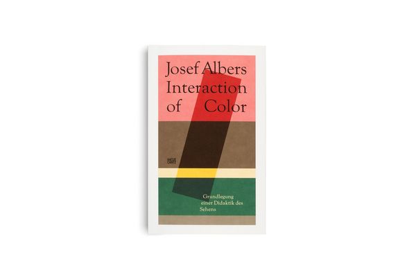





Josef Albers. Interaction of Color Grundlegung einer Didaktik des Sehens
-
- Taschenbuch ausgewählt
- eBook
-
Sprache:Deutsch
28,00 €
inkl. gesetzl. MwSt.,
Beschreibung
Produktdetails
Verkaufsrang
33000
Einband
Taschenbuch
Erscheinungsdatum
04.09.2023
Abbildungen
80 Fotos
Herausgeber
Heinz LiesbrockVerlag
Hatje Cantz VerlagSeitenzahl
244
Maße (L/B/H)
14,8/23,9/2,3 cm
Gewicht
550 g
Farbe
Hellbraun / Dunkelgrün
Auflage
1
Sprache
Deutsch
ISBN
978-3-7757-4775-2
»Wenn jemand ›Rot‹ sagt (als Bezeichnung einer Farbe) und wenn 50 Personen zuhören, darf man erwarten, dass 50 verschiedene Rot in ihrem Bewusstsein auftauchen. Man darf sicher sein, dass all diese Rot verschieden sind.« Bereits an diesen beiden ersten Sätzen, mit dem das Meisterwerk der Kunsterziehung Interaction of Color beginnt, wird klar, wie komplex die Wirkung von Farbe sein kann sowie deren visuelle Wahrnehmung.
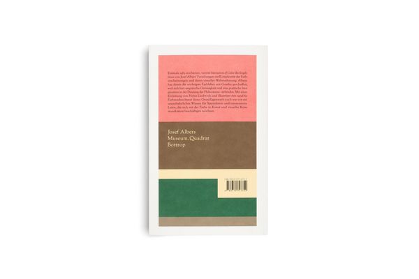
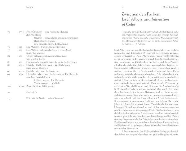
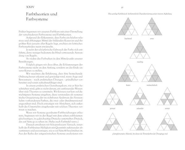
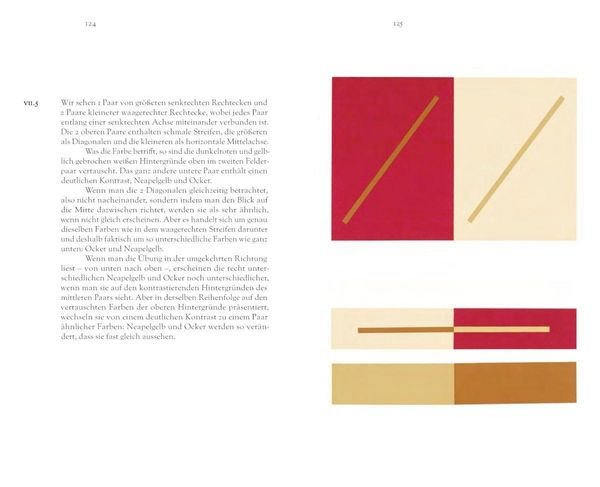
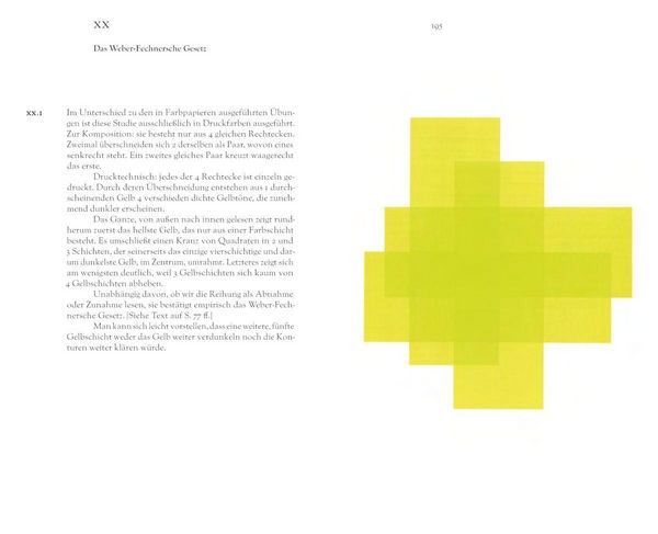
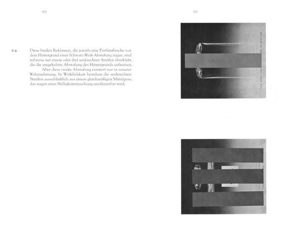
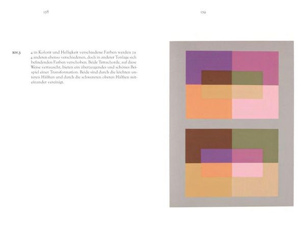
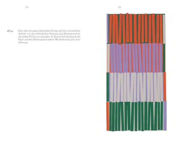
Erstmals 1963 bei Yale University Press als limitierte Siebdruckausgabe mit 150 Farbtafeln erschienen, ging dieser Text ab 1971 als Taschenbuch mit wenigen Farbtafeln in Druck. Seither wurden mehr als eine Viertelmillion Exemplare in verschiedenen Ausgaben verkauft. Dieses einflussreiche Handbuch und Lehrmittel für Künstler, Dozenten und Studenten erscheint nun, in einer aktualisierten Übersetzung und deutlich erweiterten Ausgabe, inklusive 14 ausklappbaren Seiten. Neu eingeleitet von Heinz Liesbrock sind zudem rund 60 illustrierende Farbstudien abgebildet, mit denen Albers wichtige Prinzipien und Gesetzmäßigkeiten der Farbe und ihrer Wirkung demonstriert. Dieses Handbuch bietet nach wie vor ein unentbehrliches Wissen für alle, die sich mit visueller Kommunikation beschäftigen möchten.
JOSEF ALBERS (1888, Bottrop–1976, New Heaven, Connecticut) war als Künstler, Pädagoge und Farbtheoretiker ein Pionier der künstlerischen Moderne des 20. Jahrhunderts. Er ist bekannt für seine umfassende Werkserie Homage to the Square (1950–1976). Albers lehrte am Bauhaus, am Black Mountain College und an der Yale University.
HEINZ LIESBROCK (*1953) war langjähriger Direktor des Josef Albers Museum Quadrat in Bottrop und hat vielfach zu Albers publiziert.
Ein neues Kapitel für Ihre Bücher
Ein neues Kapitel für Ihre Bücher
Schenken Sie Ihren alten Schätzen ein zweites Leben und erhalten dafür eine Thalia Geschenkkarte.
Noch keine Bewertungen vorhanden
Verfassen Sie die erste Bewertung zu diesem Artikel
Helfen Sie anderen Kundinnen und Kunden durch Ihre Meinung.
Kurze Frage zu unserer Seite
Vielen Dank für Ihr Feedback
Wir nutzen Ihr Feedback, um unsere Produktseiten zu verbessern. Bitte haben Sie Verständnis, dass wir Ihnen keine Rückmeldung geben können. Falls Sie Kontakt mit uns aufnehmen möchten, können Sie sich aber gerne an unseren Kund*innenservice wenden.
zum Kundenservice