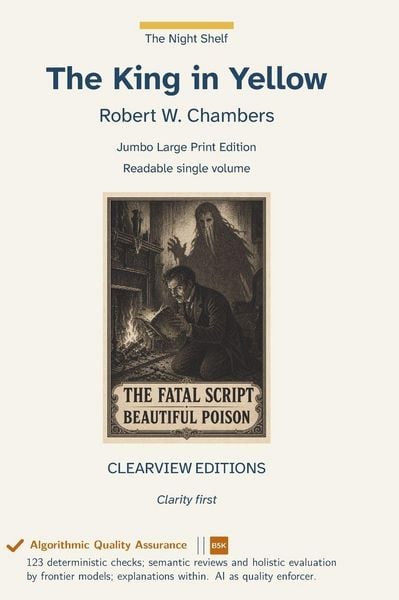
The King in Yellow
-
- Hardcover ausgewählt
- Taschenbuch
- eBook
- Hörbuch
-
Sprache:Englisch
-
Verlag:W. Frederick Zimmerman
- Outlook 44,90 €
- Pushkin Press 12,99 €
- WordFire Press 26,99 €
- Curated Collection Publishing 19,99 €
- Ingram Publishers Services 13,99 €
- Grapevine 18,99 €
- Antiquarius 25,99 €
- Lushena Books 41,99 €
- Creative Media Partners, LLC 31,99 €
- VertVolta Press 28,99 €
- Smk Books 27,99 €
- Benediction Classics 28,99 €
- Antigonos Verlag 69,90 €
- W. Frederick Zimmerman 55,99 € ausgewählt
- Antiquum Novum Verlag 49,90 €
55,99 €
inkl. gesetzl. MwSt.,
Beschreibung
Produktdetails
Einband
Gebundene Ausgabe
Erscheinungsdatum
22.09.2026
Verlag
W. Frederick ZimmermanSeitenzahl
478
Maße (L/B/H)
25,4/17,8/2,7 cm
Gewicht
1039 g
Sprache
Englisch
EAN
9798259517974
The King in Yellow by Robert W. Chambers, originally published 1895. Published in 1895, the collection joined fin-de-siècle decadence, urban unease, and supernatural fiction at the end of the nineteenth century. By letting fragments of a forbidden play infect several otherwise separate lives, Chambers makes reading itself the source of fascination, delusion, and supernatural dread. Its half-glimpsed play, Carcosa, Pallid Mask, and recurring signs became durable foundations for weird fiction and later shared mythologies.
This is a Jumbo Edition: it runs longer than our 442-page Liftable usability cap, printed in one volume up to our printer's mechanical maximum of 1,200 pages.
For collection development: this is a large-print edition intended for low-vision and aging patrons, and for any reader who finds standard trade print tiring over a long sitting. It suits large-print and accessibility collections, adult and young-adult general collections where the text is a standard, and reading-room copies where a durable case binding matters. This volume runs beyond the 442-page Liftable limit and is correspondingly heavier; a Liftable edition of the same text, divided into lighter volumes, is available under separate ISBNs. The text is unabridged and reproduced from a public-domain source without modernisation.
Algorithmic Quality Assurance: this edition was checked by 123 deterministic tests covering typography, pagination, colour, cover geometry and metadata, then read by frontier language models for semantic review and holistic evaluation. What was checked, and what those results do and do not mean, is explained in the back of the book.
This Clearview Editions hardcover is built on a production standard that significantly exceeds the industry norm for large-print publishing. The body text is set at 18-point Atkinson Hyperlegible Next on 27-point leading, 1.5 line spacing --- the minimum WCAG 2.2 Level AAA Success Criterion 1.4.8 sets for a block of text, and the figure UKAAF's large-print guidance gives as well. The leading North American large-print hardcover imprints typically set their body text at 16 point, and most large-print trade paperbacks release at 14 to 16 point. At 18 point, Clearview Editions offers text that is measurably larger than every other major large-print publisher, specifically for readers with low vision, macular degeneration, glaucoma, diabetic retinopathy, or any visual condition that makes standard trade print frustrating or impossible to read for long stretches. The trim size is equally generous. Clearview Editions is printed on a 7x10-inch page, substantially larger than the 6x9 hardcover that is standard in the large-print industry and roughly 50 percent larger by area than the 5x8 trade paperback trim most legacy large-print paperback imprints use.
The extra page area is deliberate: it allows the 18-point body to set at the 50-to-55 character line length that reading-fatigue research identifies as optimal, without the narrow text columns and cramped margins that plague smaller-trim large-print books. The body font, Atkinson Hyperlegible Next, was developed by the Braille Institute of America specifically to maximize letter recognition for readers with low vision, macular degeneration, and visual processing differences. It distinguishes between commonly-confused letter pairs - lowercase l versus uppercase I, the digit 0 versus uppercase O, b versus d, p versus q - using distinctive shape features that preserve readability even under eye strain. Text is set ragged right with no word division: WCAG 2.2 1.4.8 and UKAAF both advise against justifying large-print text, since the uneven word spacing it creates is harder to track, and against breaking a word across a line ending, since the reader then has to reassemble it.
Ein neues Kapitel für Ihre Bücher
Ein neues Kapitel für Ihre Bücher
Schenken Sie Ihren alten Schätzen ein zweites Leben und erhalten dafür eine Thalia Geschenkkarte.
Kundinnen und Kunden meinen
Kurze Frage zu unserer Seite
Vielen Dank für Ihr Feedback
Wir nutzen Ihr Feedback, um unsere Produktseiten zu verbessern. Bitte haben Sie Verständnis, dass wir Ihnen keine Rückmeldung geben können. Falls Sie Kontakt mit uns aufnehmen möchten, können Sie sich aber gerne an unseren Kund*innenservice wenden.
zum Kundenservice